


Figma is a robust design tool that has revolutionized the collaboration between designers and developers. One of its most notable features is Dev Mode, a specialized environment that connects the design and development processes seamlessly. Figma’s Dev Mode, introduced in June 2023, replaced the basic yet functional Inspect Mode. After a period of beta testing, Dev Mode was officially launched in 2024 and now requires paid seats. But this is a tool worth spending for!
In this tutorial, we’ll guide you through the effective use of Figma Dev Mode. We’ll keep the explanations clear and simple, ensuring that even beginners can easily understand. Additionally, we’ll provide real-world examples to help illustrate key concepts.
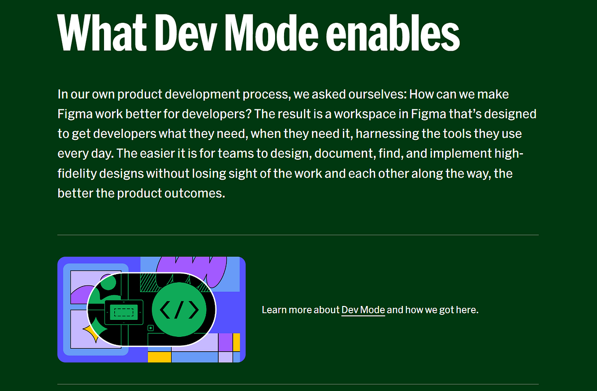
Introduction to Dev Mode
Figma Dev Mode is a specialized feature aimed at simplifying the handoff process between designers and developers, making it more efficient and less prone to errors. By providing a streamlined environment, Dev Mode allows developers to inspect every design element in detail, extract necessary assets, and export them directly into their development projects. This design mode also offers a comprehensive view of the design specifications, including dimensions, color codes, typography, and CSS properties, ensuring that developers have all the information they need to accurately implement the design. Additionally, Dev Mode facilitates better communication and collaboration between teams, helping to eliminate misunderstandings and discrepancies, and ultimately ensuring that the final product faithfully reflects the original design vision.
Getting Started with Dev Mode
1. Accessing Dev Mode
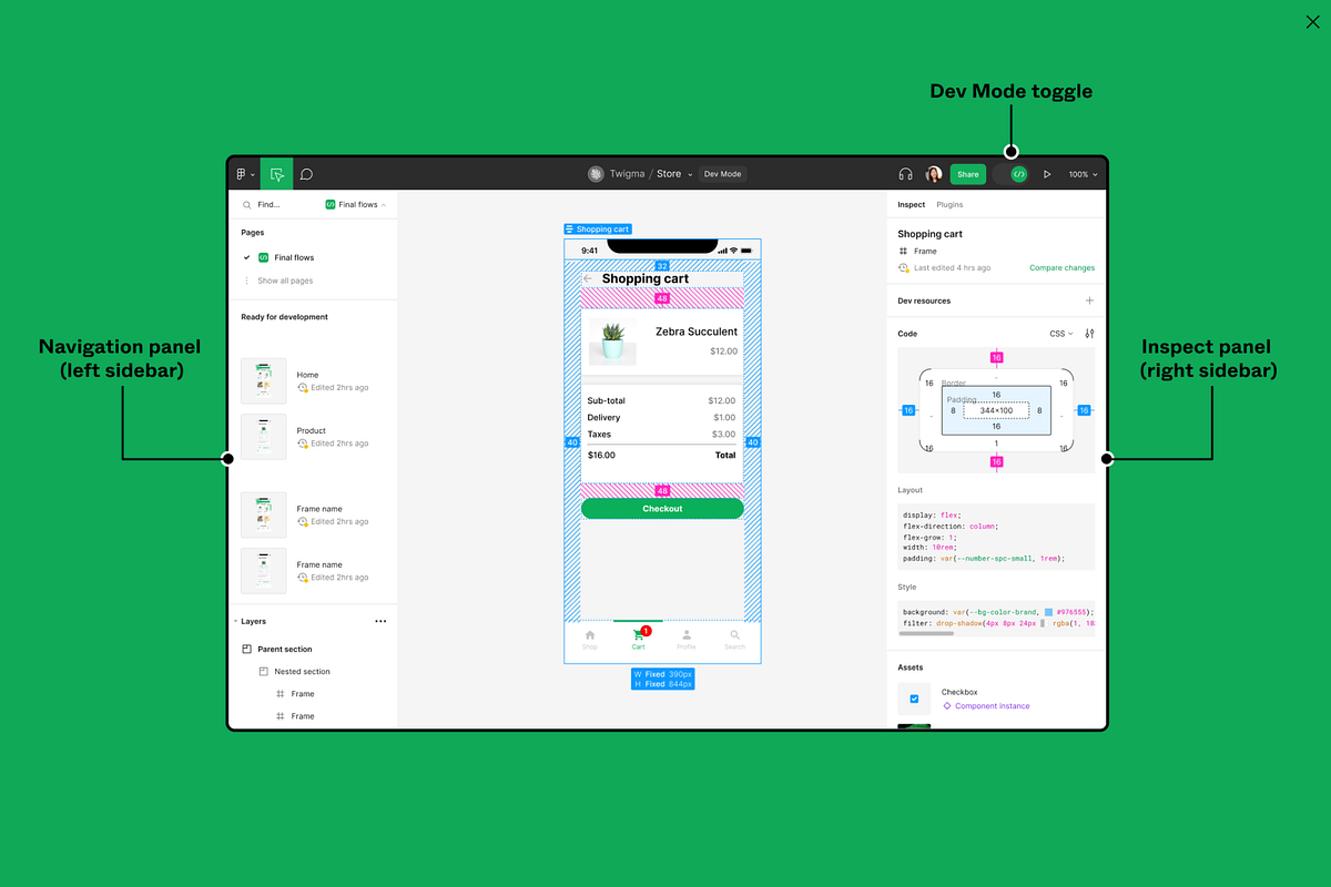
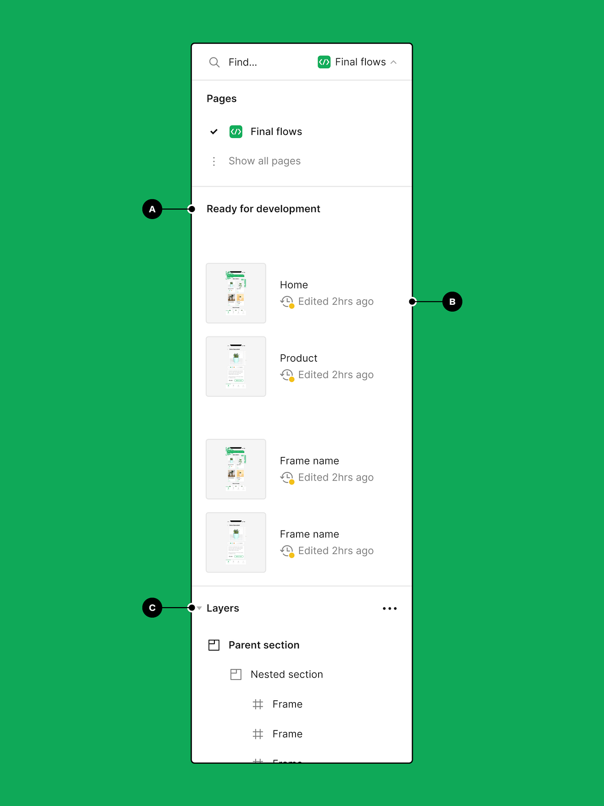
To access Dev Mode, start by opening the Figma project you are working on. Look at the top-right corner of the screen, where you’ll see a button labeled “Dev Mode.” Click on this button to toggle the switch from design, vs code view and code editor to developer view. It provides various tools and detailed information specifically tailored for developers, making the handoff process smoother and more efficient.
For example, imagine you’re working on a collaborative project for a mobile app. The designer has completed the mockups, and now it’s your turn to start coding. By switching to Dev Mode, you can access detailed specifications, CSS code snippets below, and exportable assets. This makes it easier to ensure that your code matches the design vision accurately.
2. Understanding the Interface
Once you switch to Dev Mode, you’ll notice that the layout of the interface changes slightly to display information relevant to development. You’ll see details like dimensions, CSS properties, and the ability to export assets directly from the design. This streamlined view helps you focus on what you need for coding.
For instance, suppose you’re developing the login screen of an app. In Dev Mode, clicking on the input fields and buttons will show you their exact dimensions, padding, margin, and other CSS properties. This ensures you can replicate the design accurately in your code, reducing the risk of misunderstandings between designers and developers.
By using Dev Mode in Figma, you can make the handoff process more efficient and ensure that the final product aligns perfectly with the design. This feature is particularly useful for projects where precise implementation of design elements is crucial for the overall user experience.
Inspecting Design Elements
3. Selecting and Inspecting Elements
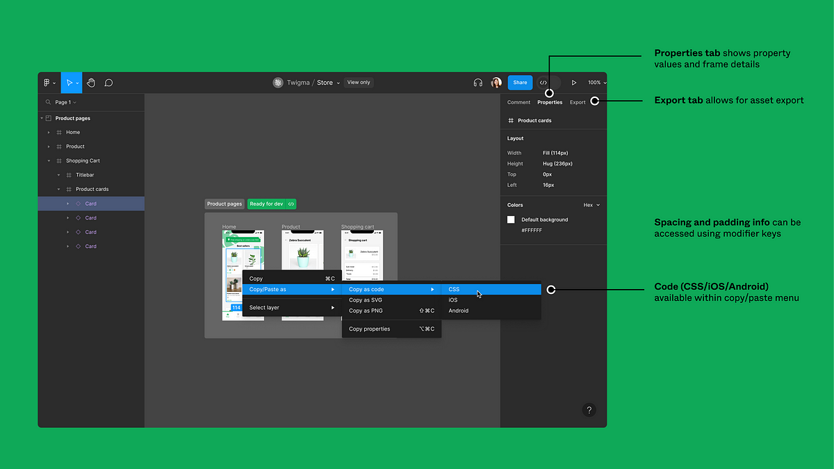
In Dev Mode, you can click on any design element to inspect its properties. This includes size, color, typography, and spacing. This detailed information is crucial for developers to ensure their implementation matches the design exactly.
For example, suppose you need to implement a custom button style. By selecting the button in Dev Mode, you can see its border-radius, background color, font size, and padding. This precise information helps you create an exact replica of actual design in your code, ensuring the button looks just as the designer intended.
4. Viewing CSS Code
For each element you select, the Figma file provides the corresponding CSS code. This includes styles for text, colors, dimensions, and other properties. You can copy this code directly into your CSS files, saving time and reducing the likelihood of errors.

For instance, if the designer has used a specific shadow effect on separate page for a card component of same page, you can view the CSS code for the shadow. The code might look like this: box-shadow: 0px 4px 10px rgba(0, 0, 0, 0.1);. Copying this code directly into your CSS file ensures that the card component matches the design perfectly, maintaining consistency throughout the project.
Exporting Assets
5. Exporting Images and Icons
Dev Mode makes creating and exporting images, icons, frames and other assets straightforward. Simply select the element you want to export and click the “Export” button. You can choose the format (PNG, SVG, etc.) and the resolution (1x, 2x, etc.).
For example, if you need to export the app logo for use in different screen sizes or languages, Dev Mode simplifies this process. Select the logo, click “Export,” and choose the required resolutions. This ensures that the logo looks crisp and clear on all devices, maintaining a professional and polished appearance across various screen sizes. By streamlining the export process, Dev Mode helps you ensure that all graphical elements meet the project’s specifications and quality standards.
Using these features in Dev Mode, you can accurately inspect and review designs and implement design elements, streamlining the development process and ensuring that the final product aligns with the design vision. This functionality is especially valuable for maintaining the integrity of the design during the transition from design to development.
Working with Components and Styles
6. Inspecting Components
Figma allows designers to create reusable components, which are essential for maintaining consistency throughout a project. In Dev Mode, you can inspect these components to understand their structure and properties. This is particularly useful when working with design systems or style guides.
For example, if your project uses a consistent set of components for buttons, cards, and headers, inspecting these in Dev Mode is invaluable. You can see the standardized properties such as padding, margins, and font sizes, ensuring uniformity across your application. By understanding the detailed setup of each component, you can replicate them accurately in your code, maintaining a cohesive look and feel throughout the project.
7. Accessing Design Tokens
Design tokens are variables that store design decisions like colors, fonts, and spacing. In Dev Mode, you can view these tokens and see how they are applied across the design. This feature is crucial for maintaining consistency and simplifying updates.
For instance, if the primary color for the app is stored as a design token, Dev Mode will show how this token is used for various elements like buttons, links, and headers. By using the same token in your CSS, this code lets you ensure that any future changes to the primary color are easily managed. This approach saves time while ensuring that your design remains consistent and easily adaptable to changes.
Collaborative Features
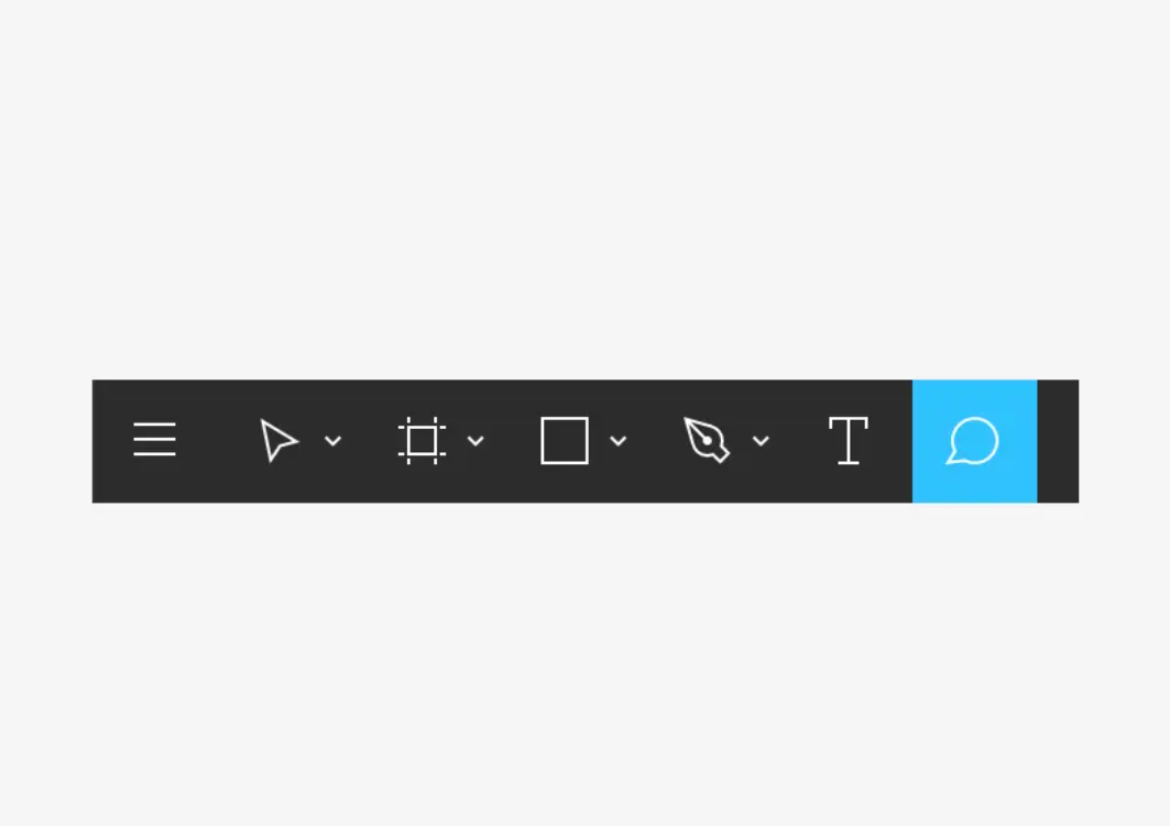
8. Commenting and Feedback
Dev Mode enhances collaboration by supporting commenting on specific elements. You can leave comments directly on code section versions of the design, asking for clarification or providing feedback. This feature streamlines communication between designers and developers, ensuring that everyone stays aligned.
For instance, if you notice that a particular icon doesn’t fit well within the context switching the design, you can leave a comment in Dev Mode, tagging the designer and the organization and asking for a possible adjustment. This keeps all communication within the organization and the project context, making it easier to track and resolve issues. By having a centralized place for feedback, the team can quickly address concerns and make necessary adjustments.
9. Sharing Specs with the Team
Dev Mode allows you to share the specific details of any design element with your team. This feature ensures that everyone has access to the latest design file specifications, promoting consistency and accuracy in the design file development process.
For example, if the development team needs to implement a an object or new feature, you can share the specs directly from Dev Mode. This ensures that every team member has the exact details needed, such as dimensions, colors, and CSS properties, reducing the risk of discrepancies and misunderstandings. By providing clear and accessible specifications, you facilitate smoother and more efficient collaboration across the team.
Important Plugins Used in Figma Dev Mode
10. Custom Plugins
To further enhance the functionality and efficiency of Dev Mode, Figma supports various plugins. These plugins offer additional features and tools that can be extremely useful for both designers and developers. Here are some important plugins used in Figma Dev Mode, their features, and how to use them:
Zeplin
Zeplin integrates seamlessly with Figma, providing a bridge between design and development. It offers features like asset export, design specs, and style guides. Zeplin also supports team collaboration, making it easy to share designs and specifications with the entire team.
To use Zeplin, you need to install the plugin from the Figma Plugin Library. Once installed, you can select the elements you want to export and use the plugin to upload them to Zeplin. This allows developers to access the Figma design files, specs and assets directly from Zeplin, ensuring consistency and accuracy.
Avocode
Avocode is another powerful plugin that helps in the handoff process between designers and developers. It allows for seamless design inspection, code generation, and asset export. Avocode supports multiple platforms, making it versatile and useful for various development environments.
After installing the Avocode plugin, you can sync your Figma designs with Avocode by selecting the artboards or elements you want to export. Avocode then generates the necessary code snippets and assets, which developers can access through the Avocode app or web interface.
Anima
Anima is a versatile plugin that allows designers to create high-fidelity prototypes and export responsive code. It supports HTML, CSS, and React code generation, making it an excellent tool for developers looking to build responsive and interactive websites or applications.
To use Anima, install the plugin from the default Figma Plugin Library. You can then create responsive prototypes by adding breakpoints and interactive elements. Once the design is complete, Anima generates the necessary code, which developers can use to build the final product.
Figma to HTML
This plugin converts Figma designs into HTML and CSS code, streamlining the handoff process. It’s particularly useful for developers who need to translate static designs into functional web pages.
Install the Figma to HTML plugin from the Plugin Library. Select the frames or elements you want to convert, and the plugin will generate the corresponding HTML and CSS code. You can then copy this code and integrate it into your development environment.
Content Reel
Content Reel helps designers and developers by providing realistic content for designs. It includes text, images, and icons, which can be used to have users create more accurate and lifelike prototypes.
After installing Content Reel, you can use it to populate your designs with placeholder objects and content. This is particularly useful during the design phase, as it allows you space to experiment and visualize how the final product will look and feel with actual content.
Measure
Measure is a plugin that allows you to generate detailed, design files with specifications and measurements. This is useful for developers who need precise information about spacing, dimensions, and other design details.
Install the Measure plugin from the Plugin Library. Select the elements you want to inspect, and the plugin will generate a detailed spec sheet that includes all relevant measurements and properties. This spec sheet can be shared with the development team to ensure accuracy.
Using these plugins in Figma Dev Mode can significantly enhance the workflow between designers and developers teams, ensuring that designs are accurately implemented and that the final product matches the developer’ design vision. These tools provide additional features that streamline the handoff process, reduce errors, and improve collaboration across the team.
Wrapping Up
Dev Mode in Figma is an invaluable tool that enhances the collaboration between designers and developers. By providing detailed specs, easy asset exports, and robust collaboration features, it ensures that your development process is efficient and accurate. Whether you’re working on a simple website or a complex application, mastering Dev Mode will up developer productivity and help you deliver high-quality, consistent results.
By following this step-by-step guide, you’ll be able to use Dev Mode to collaborate effectively, making your development process smoother and more enjoyable. Remember, the key to successful design and development collaboration lies in clear communication and using the right tools. Figma’s Dev Mode is designed to facilitate just that, helping you bring your design visions to life with precision and ease.

References:
https://help.figma.com/hc/en-us/articles/15023124644247-Guide-to-Dev-Mode
https://www.figma.com/blog/everything-you-need-to-know-about-dev-mode/
https://www.frontitude.com/guides/using-figma-dev-mode-plugin
https://bootcamp.uxdesign.cc/figma-developer-mode-a-new-way-to-inspect-and-navigate-designs-8ad9120dda2a
https://blog.logrocket.com/ux-design/figma-dev-mode


